2024-11-07 17:11
IndustriTypes of Forex Charts: Line Chart v Bar Chart v Ca
Forex traders use charts to determine market direction and identify possible buying and selling opportunities. There are three types of charts commonly used in forex that you can flick between on MT4:
Line chart;
Bar chart;
Candlestick chart.
Line Chart:
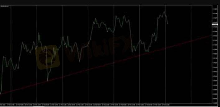
These charts are handy for quickly determining the trend – only the current/close price is graphed – as such these charts should not be used for placing stop loss or take profit orders.
Bar Chart:
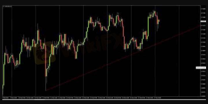
The chart is created with the use of bars where each bar has a high (top) and a low (bottom) with a line on either side; right side being the opening price and the left side being the closing price for the selected time period
Different colours can be used to identify bars that close higher than the open (bull or up bars) or lower than the open (bear or down bars). The example above has green lines for up bars and red bars for down bars. These charts show all the information you need but most traders and analysts tend to favour the third option – Candlestick charts.
Candlestick Chart:
This chart is created much like bar charts, with the only difference being that candlesticks add dimension and colour to the Bar Chart by depicting the area of the bar between the open and close as a two dimensional real body.
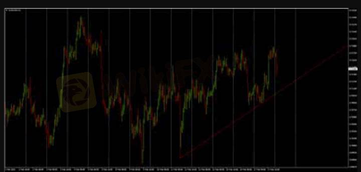
Candlesticks are comprised of a body which represents the difference between the open and close prices. An up candlestick occurs when the close is higher than the open – and down candlesticks occurs when the close is lower than the high. In the chart example above, up candlesticks are green whilst down candlesticks are red. If the open is equal to the close there will not be a body, just a line – this type of candle is referred to as a “Doji”.
The thinner lines extending beyond the body are called ‘Wicks’ – above the body is the high and below the body is the low for the selected time period. A large wick (relative to the body), indicates a potential turning point (support/resistance).
Suka 0

张军17995
Trader
Diskusi populer
Industri
СЕКРЕТ ЖЕНСКОГО ФОРЕКСА
Industri
УКРАИНА СОБИРАЕТСЯ СТАТЬ ЛИДЕРОМ НА РЫНКЕ NFT
Industri
Alasan Investasi Bodong Tumbuh Subur di Indonesia
Industri
Forex Eropa EURUSD 29 Maret: Berusaha Naik dari Terendah 4 Bulan
Analisis pasar
Bursa Asia Kebakaran, Eh... IHSG Ikut-ikutan
Analisis pasar
Kinerja BUMN Karya Disinggung Dahlan Iskan, Sahamnya Pada Rontok
Klasifikasi pasar

Platform

Pameran

Agen

Perekrutan

EA

Industri

Pasar

Indeks
Types of Forex Charts: Line Chart v Bar Chart v Ca
 | 2024-11-07 17:11
Forex traders use charts to determine market direction and identify possible buying and selling opportunities. There are three types of charts commonly used in forex that you can flick between on MT4:
Line chart;
Bar chart;
Candlestick chart.
Line Chart:
These charts are handy for quickly determining the trend – only the current/close price is graphed – as such these charts should not be used for placing stop loss or take profit orders.
Bar Chart:
The chart is created with the use of bars where each bar has a high (top) and a low (bottom) with a line on either side; right side being the opening price and the left side being the closing price for the selected time period
Different colours can be used to identify bars that close higher than the open (bull or up bars) or lower than the open (bear or down bars). The example above has green lines for up bars and red bars for down bars. These charts show all the information you need but most traders and analysts tend to favour the third option – Candlestick charts.
Candlestick Chart:
This chart is created much like bar charts, with the only difference being that candlesticks add dimension and colour to the Bar Chart by depicting the area of the bar between the open and close as a two dimensional real body.
Candlesticks are comprised of a body which represents the difference between the open and close prices. An up candlestick occurs when the close is higher than the open – and down candlesticks occurs when the close is lower than the high. In the chart example above, up candlesticks are green whilst down candlesticks are red. If the open is equal to the close there will not be a body, just a line – this type of candle is referred to as a “Doji”.
The thinner lines extending beyond the body are called ‘Wicks’ – above the body is the high and below the body is the low for the selected time period. A large wick (relative to the body), indicates a potential turning point (support/resistance).
Suka 0
Saya juga ingin komentar
Tanyakan pertanyaan
0Komentar

Belum ada yang berkomentar, segera jadi yang pertama


Tanyakan pertanyaan
Belum ada yang berkomentar, segera jadi yang pertama